
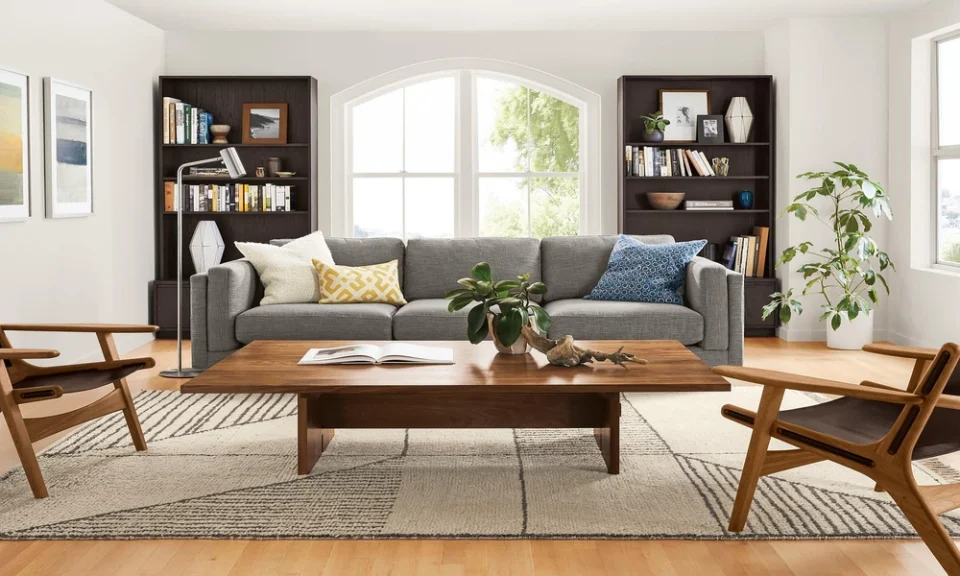
The fear of mixing wood tones is one of the most common reasons people end up with rooms that feel safe but lifeless – every piece from the same collection, every finish matching, nothing that looks like it belongs to a real person’s life. The irony is that perfectly matched furniture is actually harder to pull off than a well-considered mix. A room where every piece shares the same finish reads as a showroom floor, not a home. Understanding why mixing works – and how to do it intentionally – produces rooms that feel both put-together and genuinely lived in.
Why Matching Everything Backfires
When every piece of furniture in a room shares the exact same wood tone and finish, the eye has nothing interesting to move between. The room registers as a single unit rather than a composition of distinct elements, and that uniformity produces a flatness that feels commercial rather than personal. Furniture showrooms match everything for exactly this reason – it makes individual pieces easier to sell by removing visual competition. It doesn’t make for interesting rooms.
Real homes accumulate furniture over time, across different purchases and different periods of life. A dining table inherited from a grandparent, chairs bought last year, a sideboard from a vintage shop – these pieces having different finishes is a natural consequence of how homes actually develop. The goal isn’t to fight that reality but to work with it deliberately.
The Rules That Make Mixing Work
Mixing wood tones successfully isn’t random – it follows a loose set of principles that, once understood, make the process considerably less intimidating.
Contrast over competition is the first principle. Woods that are clearly different read as intentional. A light oak dining table paired with walnut chairs creates a relationship between the two tones. A medium oak table paired with a slightly different medium oak chair creates a relationship too – but one that looks like a mistake rather than a choice. When you mix, commit to the difference.
Undertone harmony matters more than tone matching. Wood finishes have undertones – warm (red, orange, yellow) or cool (gray, green). Mixing within the same undertone family produces cohesion even when the tones themselves are very different. A honey oak and a rich walnut both have warm undertones and live comfortably together. A warm oak and a gray-washed ash, despite both being relatively light, can clash because their undertones pull in opposite directions.
Limit the mix to two or three distinct tones per room. More than that and the room starts to feel unsettled rather than curated. Identify the dominant tone – usually the largest piece, like a sofa table or dining set – and build from there, treating additional tones as accents rather than equals.
Flooring as the Wildcard
The floor is the wood tone that complicates everything else, because it’s typically fixed and covers the most surface area in the room. The good news is that flooring and furniture wood tones don’t need to match – they just need to be in conversation.
A general principle worth knowing: furniture that closely matches the floor tone tends to disappear visually, making the room feel heavier and less defined. Furniture that contrasts with the floor – lighter pieces on a dark floor, darker pieces on a light floor – creates definition and makes both the floor and the furniture more visible. This is why interior designers often recommend going against the floor rather than matching it.
When reading Coleman Furniture reviews for pieces being considered alongside existing flooring, it’s worth paying attention to comments that describe the finish in natural light rather than relying solely on product photography, which is shot under controlled conditions that rarely match a typical home environment.
Bringing It Together With Consistent Elements
The thing that holds a mixed-tone room together isn’t the wood – it’s everything else. Consistent metal finishes across hardware, lighting, and decorative objects create a thread of coherence that makes diverse wood tones feel deliberate rather than accidental. If the dining chairs have brushed brass legs, pulling that brass tone into the light fixture and the cabinet hardware ties the room together visually regardless of how many different wood tones are present.
Textiles do similar work. A rug, curtains, and throw pillows that reference colors present in both wood tones create a bridge between them. A warm rust textile that picks up both the orange in a honey oak table and the red in a walnut sideboard makes the two pieces feel like they belong in the same room without matching each other.
The Test Worth Doing
Before committing to a furniture purchase, photograph your existing pieces and any new ones you’re considering together in natural light. Our eyes adapt to individual pieces in a showroom or on a screen; a photograph shows how the relationship between them will actually read in the room.
Mixed wood tones that look intentional in a photograph will look intentional in the room. Mixed tones that look like a mistake in a photograph will look like one there too – and fixing that after delivery is considerably harder than catching it before.
The goal is a room that looks like it was assembled by someone with taste rather than purchased as a set. That takes a little more thought, and the result is considerably better.
